Product Optimization through UX
About
Project overview
Santander Bank aimed to accelerate digital sales by improving how users apply for and activate financial products online. I joined the CRO Lab — a strategic, data-driven initiative — to optimize key journeys like onboarding, credit card acquisition, and mortgage simulation.
As UX Designer and CRO Specialist, I worked end-to-end: from audits and behavior analysis to design strategy and experimentation. My focus was turning insights into scalable improvements that enhanced UX and increased product uptake.
Challenges
Balancing business goals with customer needs required deep understanding of both conversion metrics and user behavior. It involved:
Uncovering friction through research and data
Aligning teams around UX-led experimentation
Designing high-performing flows without sacrificing clarity or trust
Every decision was grounded in behavioral insight — and validated through continuous testing.

Process & Approach
From Insight to Experimentation: CRO Process
To optimize Santander’s digital journeys, we followed a structured process grounded in user behavior and experimentation.
We started by gathering insights from heatmaps, session recordings, and surveys — identifying where and why users were dropping off. From there, we defined clear goals aligned with the business: reduce friction, improve clarity, and increase conversions.
Next, we translated insights into hypotheses and prioritized them using an effort–impact framework. Each test had defined KPIs and success criteria, ensuring alignment across design, product, and CRO teams.
Working closely with developers and analysts, we implemented A/B tests and monitored performance in real-time. Test results directly informed our next design iterations — turning insight into measurable outcome

Discovery & insights
Uncovering Hidden Friction through Data Analysis
To understand where users were dropping off — and why — we began with a deep dive into behavioral data. I combined heuristic analysis with heatmaps and funnel metrics to identify conversion blockers that weren’t visible in static flows.
To uncover the true blockers in the experience, I led a deep discovery phase combining:
Behavioral data (heatmaps, scroll maps, session replays)
Funnel metrics to detect where and when users were dropping off
Heuristic audits to spot usability issues and content mismatches

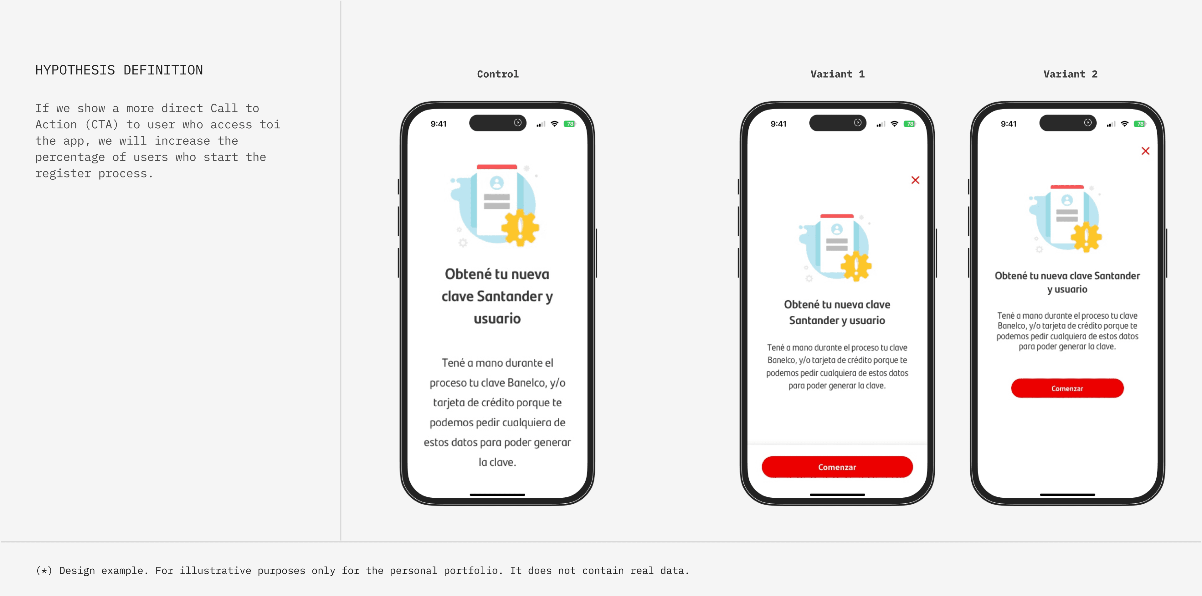
Hypothesis formula
From Insight to Hypothesis
Based on the findings from the research phase, we formulated a series of hypotheses aimed at addressing the identified pain points and improving the overall user experience.
Each hypothesis was framed as a testable proposition, allowing us to make informed decisions about where to focus our optimization efforts.
Unlocking Insights
Our approach was deeply rooted in understanding the needs and expectations of Santander Bank's customers.
Through data analysis, we gained insights into user behaviors and preferences, experience pain points and source of potential frictions.

Experimentation & Tests
Validating Design Decisions through Targeted Experiments
Every UX intervention we proposed was tested through structured A/B or multivariate experiments. My role involved translating design hypotheses into testable variants, collaborating with CRO analysts to define success metrics, and ensuring tests were technically feasible and ethically sound. We prioritized tests based on potential business impact and user friction level — not just ease of implementation.
I worked closely with CRO analysts to:
Translate qualitative and behavioral insights into clear, testable hypotheses
Define success metrics tied to both business KPIs (e.g., conversion rates, completion %) and UX outcomes (e.g., reduced drop-offs, fewer errors)
Ensure every experiment was technically feasible, ethically sound, and statistically valid

Behavioral design
Designing for Human Behavior
Drawing from principles of behavioral economics and cognitive psychology, I focused on designing experiences that aligned with how people naturally think, decide, and behave under uncertainty. Instead of assuming rational user behavior, I acknowledged that users rely on mental shortcuts (heuristics) and are prone to cognitive biases — especially in complex, high-stakes flows like financial applications.
My goal was to minimize hesitation and increase clarity by leveraging behavioral triggers, simplifying decision-making, and guiding attention where it mattered most.


Psychological triggers
Testing in the real world
Each design direction was validated in production through structured A/B and multivariate tests. I partnered with the CRO team to monitor each experiment in real-time and track metrics like:
Conversion lift
Drop-off reduction
Form error rates
Time-to-completion
Some of our most successful tests included:
A mobile form redesign that reduced cognitive load and improved completion rates by 18%
A content hierarchy revamp that increased CTA engagement by 12%
A behavioral prompt that drove a 15% lift in credit card applications


Outcomes
Lessons Learned
This project reinforced some critical principles:
You can’t fix what you can’t see: Session replays and behavioral data uncovered issues that static designs couldn’t.
Behavior trumps assumption: Users rarely do what we expect — test everything.
Not all friction is bad: Some hesitation is productive. Our job is to remove the unnecessary, not the thoughtful.
Microcopy matters: A single word can shift user behavior.
Collaboration is a multiplier: Working with analysts from day one saved time and made our tests smarter.