About
Project overview
The navify App Marketplace is a digital platform that enables healthcare professionals to discover, compare, and adopt digital solutions from Roche and third-party partners. I shaped the end-to-end product experience — from aligning business goals to defining UX strategy, leading accessibility implementation, and delivering scalable, reusable design components.
The challenge
Before navify Marketplace, Roche's digital solutions were scattered across disconnected portals, making it difficult for users to find, compare, and trust the right products. The experience was fragmented, non-transparent, and inconsistent across platforms.

Approach
End-to-End Process & Methodology
Strategy and planning

Fragmented user journey

Discovery & Research
Immersion & Insights
In the initial phase of the project, we began by immersing ourselves in the existing ecosystem to understand both user frustrations and business expectations.
We interviewed lab directors and lab technicion to validate the marketplace’s viability and desirability. We led stakeholder workshops to align on business goals and pain points.
What we did
Mapped out decision-making journeys (Explore, Compare, Evaluate, Act)
Identified key roles and pain points.
Collaborated with internal product teams to understand technical constraints.
Identified missing content and lack of trust.
What we found
A fragmented decision-making journey.
Challenging product discovery for professional and non-professional users.
Insufficient decision-making content and relevant product information.
Lack of trust to the content and locate relevant products.

User centric design | persona
Understanding behaviors to drive decision making
Target Audience Validation
Lab managers have been validated as a key audience for web touchpoints. They actively search for product information in marketplaces and play an influential role in decision-making, often bridging medical and non-medical stakeholders.
Pre-Sales Experience:
Purchasing decisions are rarely made by individuals; instead, expert groups (medical & non-medical) collaborate in face-to-face meetings.
The website serves as a quick reference for product overviews.
Lab managers translate medical details into key financial insights for CFOs / CEOs.

Design & iteration
From Concept to Execution
Designing for trust, clarity, and scale
With a solid foundation, I transitioned into design and prototyping. I started with low-fidelity wireframes to test flow logic and quickly moved into high-fidelity designs to validate interaction patterns and visual clarity. At every step, I kept two principles at the core: build trust, and reduce friction.

Solution
Fostering Decision Making
User Centered Design & Content quality
The pain points highlighted by users include frustration with poor product information that lacks transparency, unbiased and scientific details, as well as comprehensive data about the product, all of which they consider essential in the decision-making process.
We focused on enhancing the decision-making drivers, particularly by improving content quality which, together with detailed technical data ensures that users receive in-depth information about each product.

Customer voice: building trust and credibility
Testimonials from satisfied customers are a powerful form of user social proof in user experience. They can be used to build trust, create social validation, and provide examples of how a product or service has helped others.
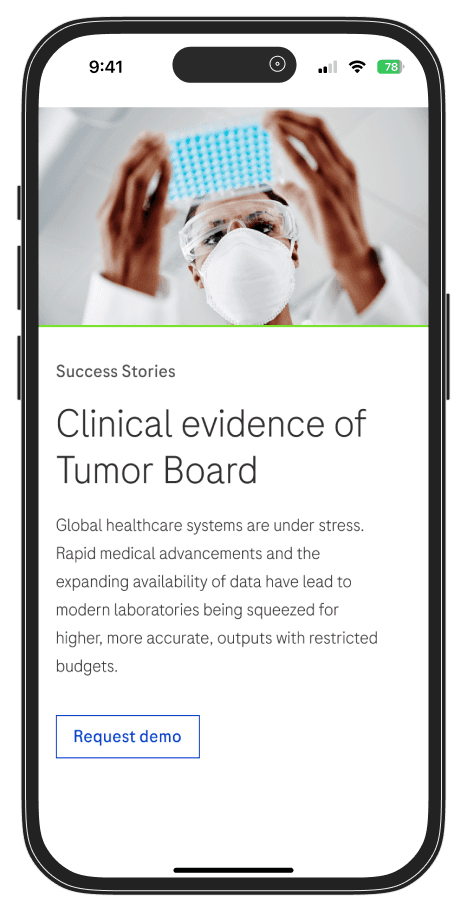
Success Customer Stories
Importance of showing the product value in the context of relevant case studies and examples that can resonate to customers.
Success customer stories allows to build trust and align solutions with their needs by showcasing how similar challenges were effectively resolved, turning abstract features into actionable outcomes that resonate and drive conversions.

Tailored content
Currently, all users see the same content without considering their profile or any other information that would enable segmentation to display content of their interest. This lack of segmentation can make it difficult to perform a satisfying search for a product that meets the user's needs.
The main goal of personalization is to deliver content and functionality that matches specific user needs or interests, with no effort from the targeted users
Outcomes & impact
Why This Approach Made a Difference
This wasn’t just about refining a product — it was about enabling Roche to meet its customers with the clarity, trust, and transparency they deserve. The methodology allowed us to move quickly, yet intentionally, balancing the needs.
By deeply understanding our users, aligning stakeholders across silos, and treating accessibility as a core requirement — not an afterthought — we built something more than a website. We built a platform people could trust.
+100
Products and services published in app marketplace in first months
+70
Countries rolled out and local pages published
+118K
Active users
8/10
Stakeholders found the platform intuitive
75%
of participants said it would improve their decision-making
+40%
User engagement
Outcomes & impact
Takeaways
This project taught me how to design for trust at scale — especially in regulated, multi-stakeholder environments. I learned how to:
Lead alignment workshops across business, tech, and design.
Embed accessibility into every phase of the product lifecycle.
Advocate for clarity and usability even when complexity is inevitable.
I now approach every project with the conviction that accessibility, trust, and UX clarity are not features — they are foundations.